Back to Home
Follow us: Behance, Instagram
© Yuta Takahashi.jp
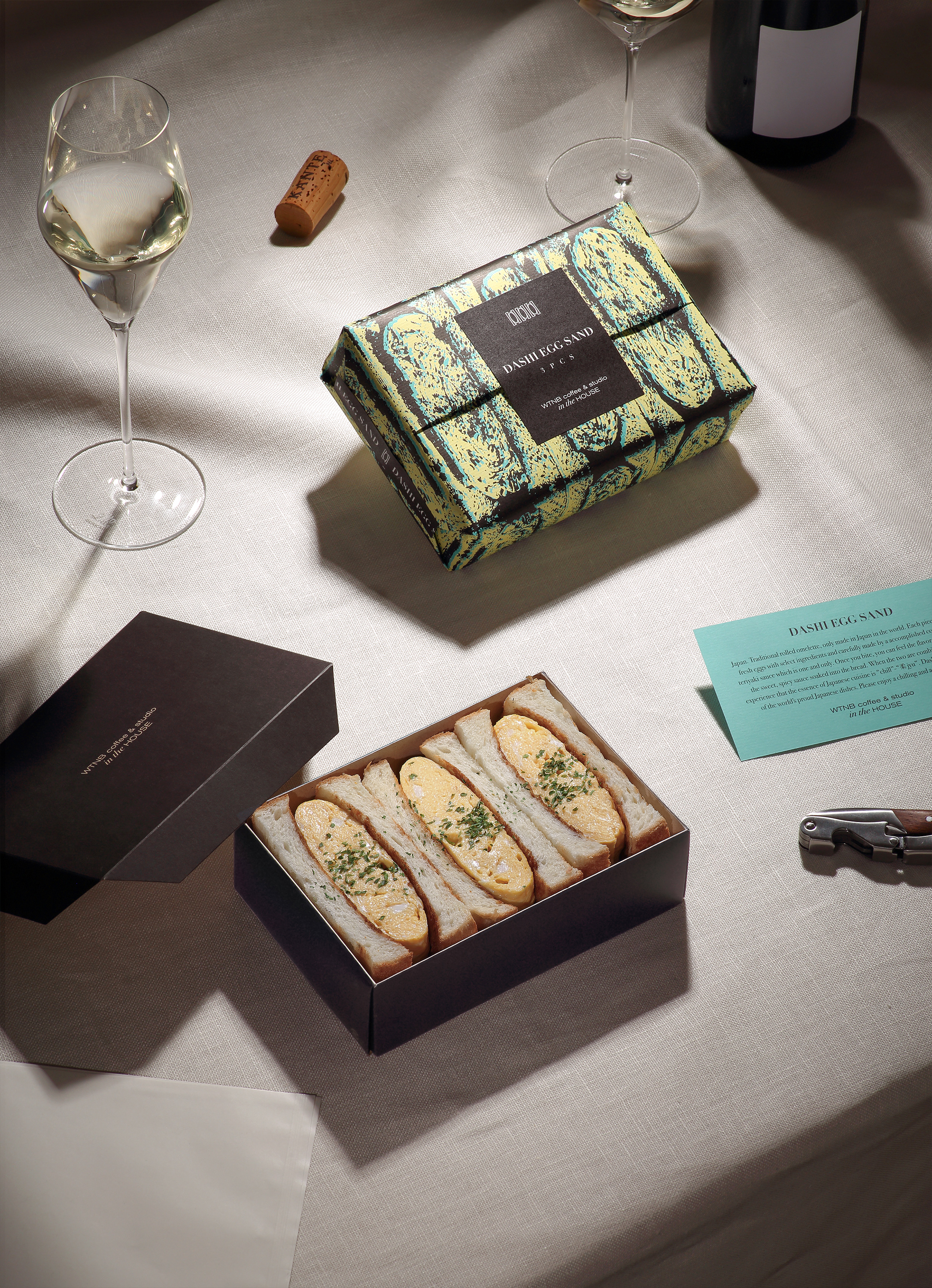
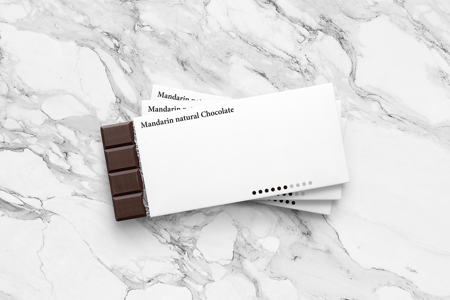
Announcing the WTNB coffee & studio in the HOUSE "DASHI EGG SAND" package design by Yuta Takahashi.
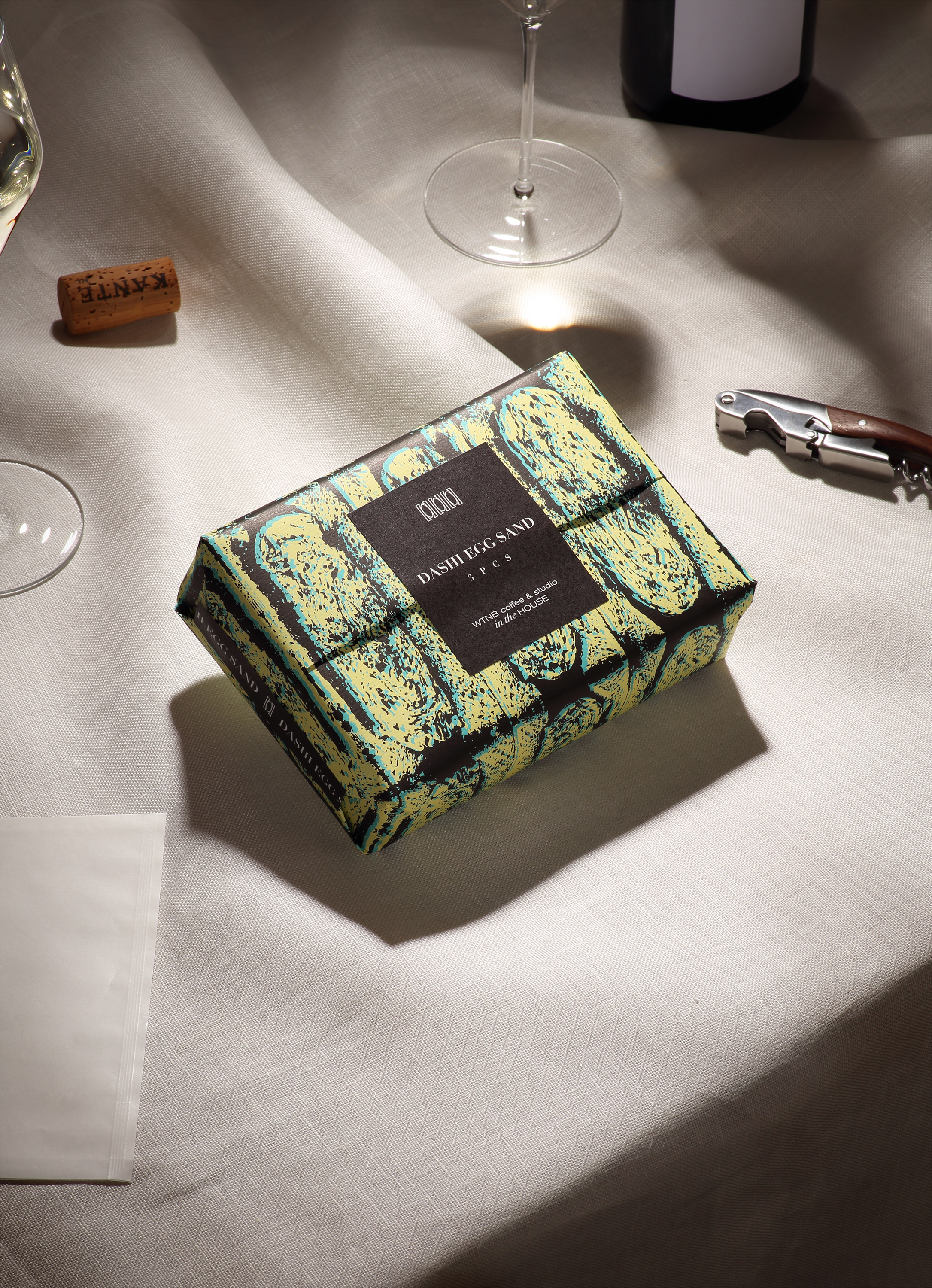
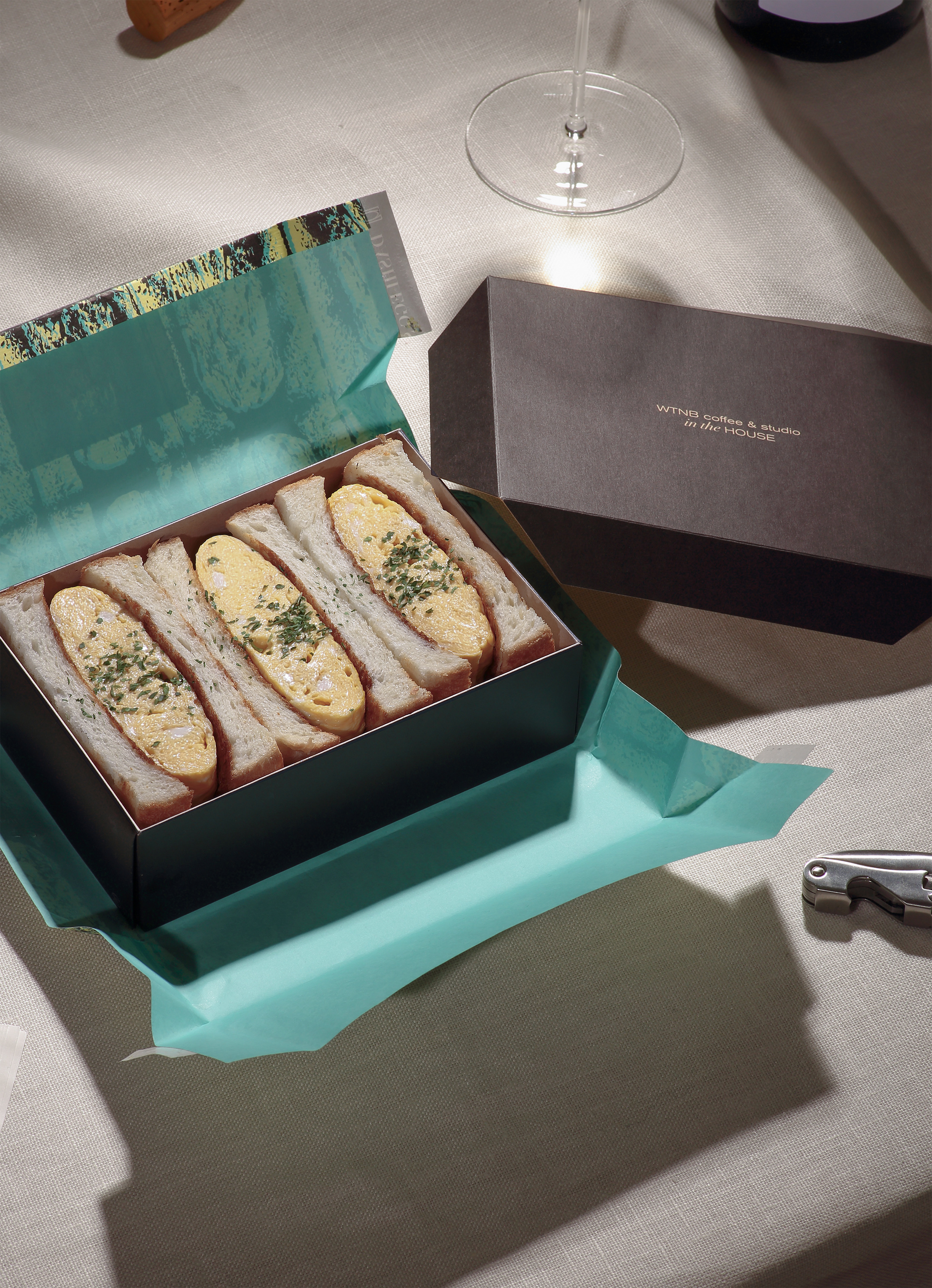
A packaging design used for Japanese Omelette Sandwich meant for takeout. The necessary elements for an aesthetic culinary experience can also be thought of in takeout food. As COVID-19 has increased takeout consumption, we felt the need for a package that would ensure meals weren't simply consumed.
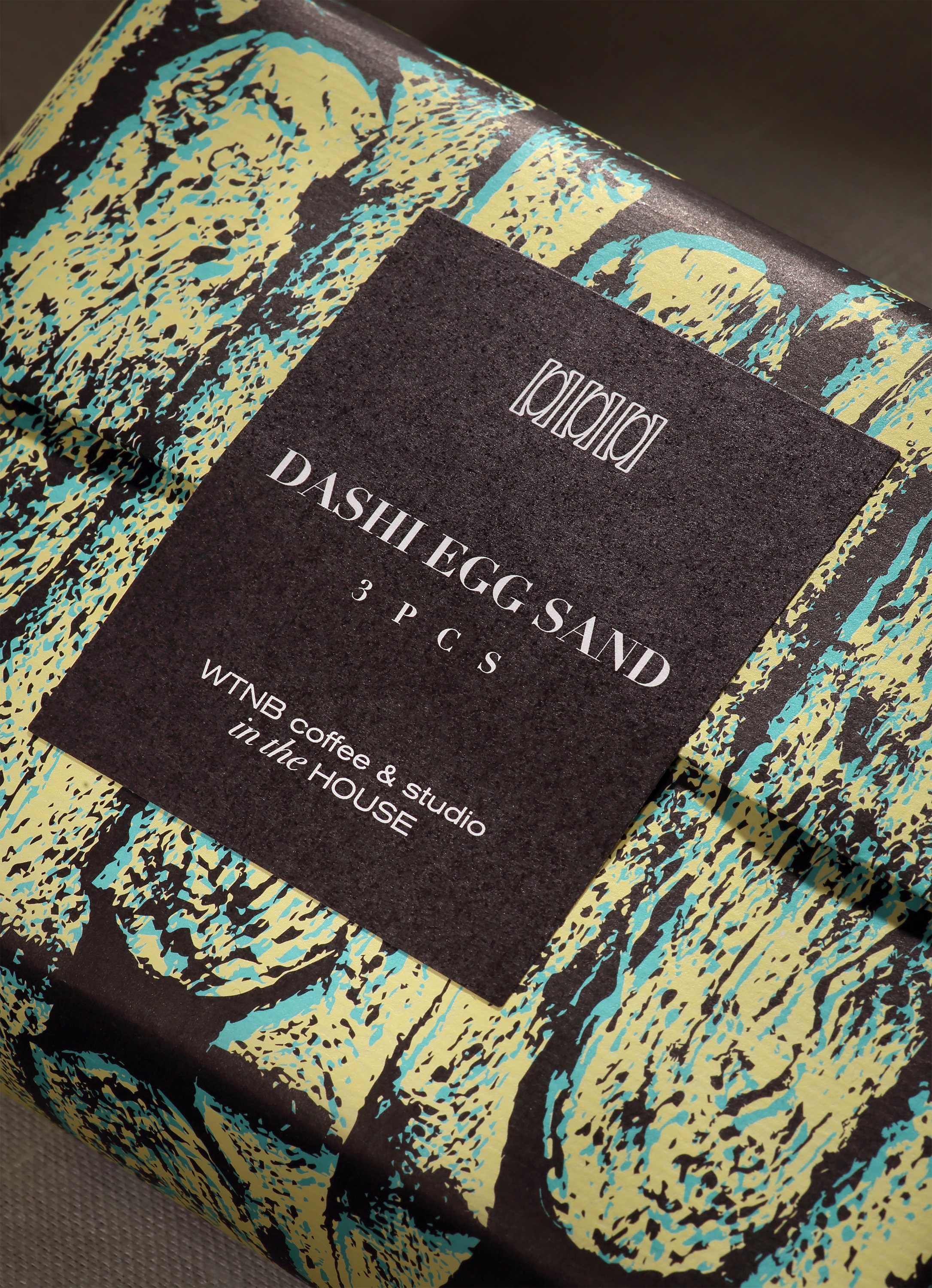
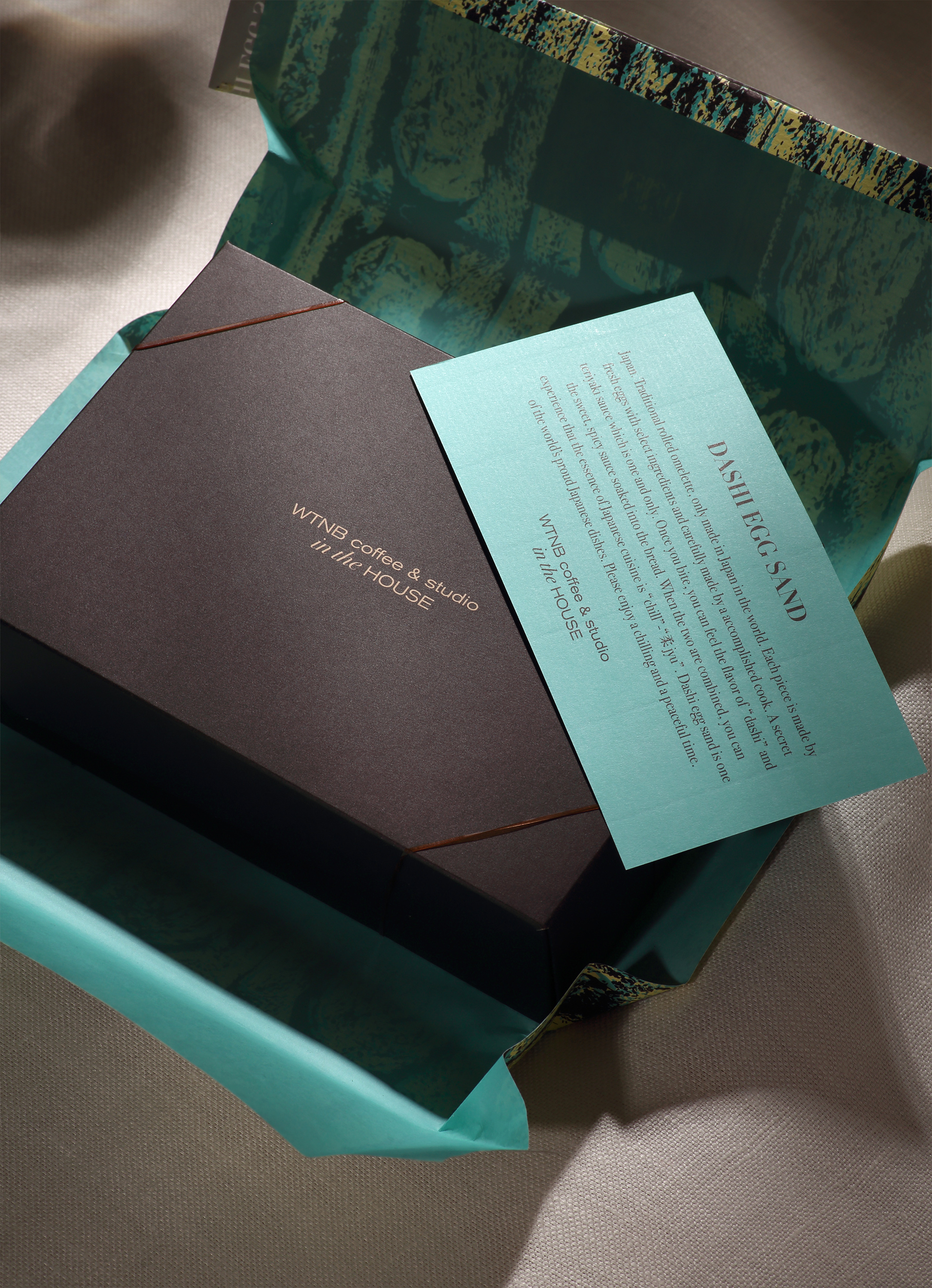
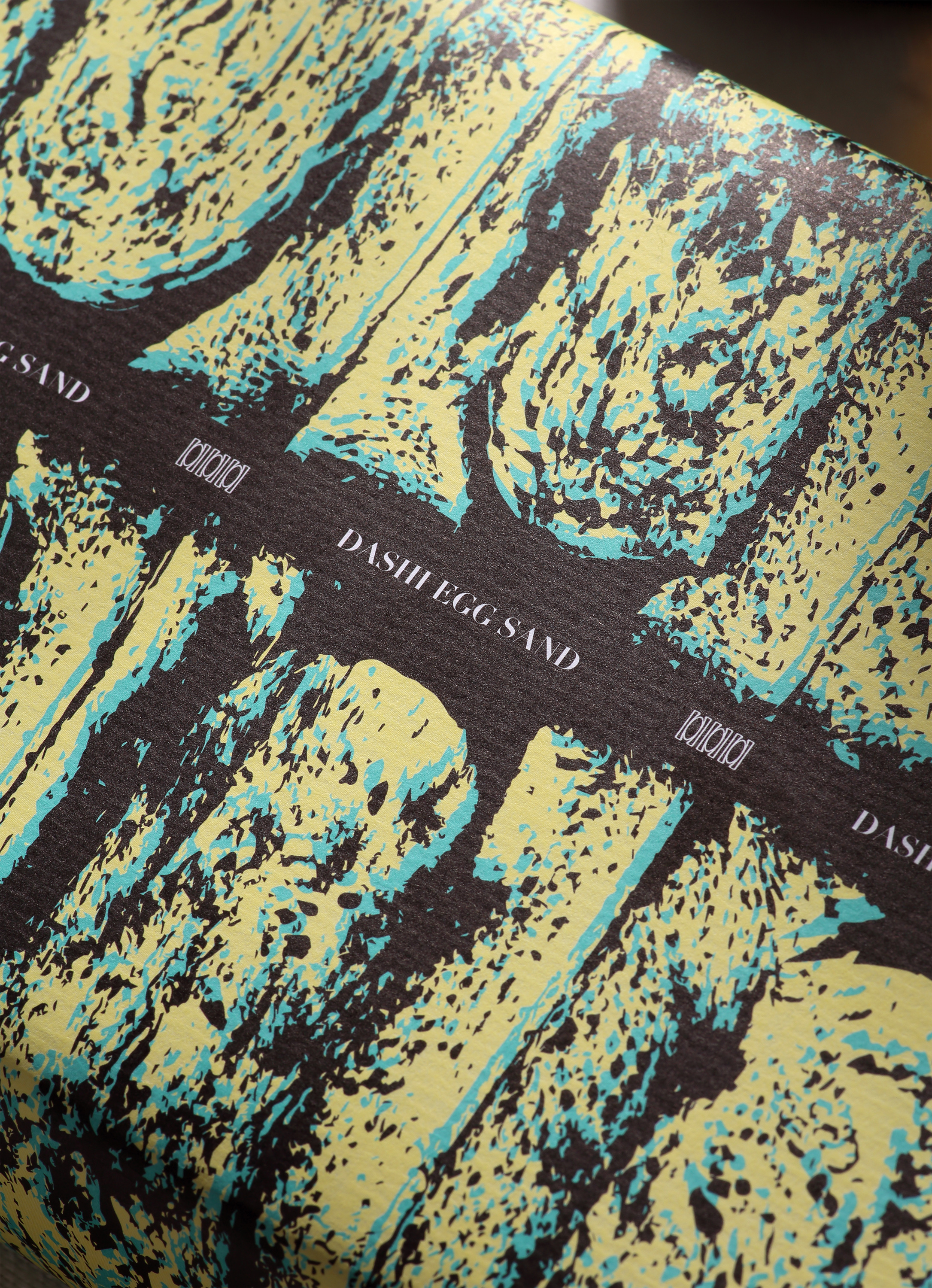
This design was born from the idea of how to express the goodness of the contents in the package. The soft wrapping paper and the illustrations on it are reminiscent of the gentletaste and texture of food. The wrapping paper has the illustration of a Sandwich's cross-section.
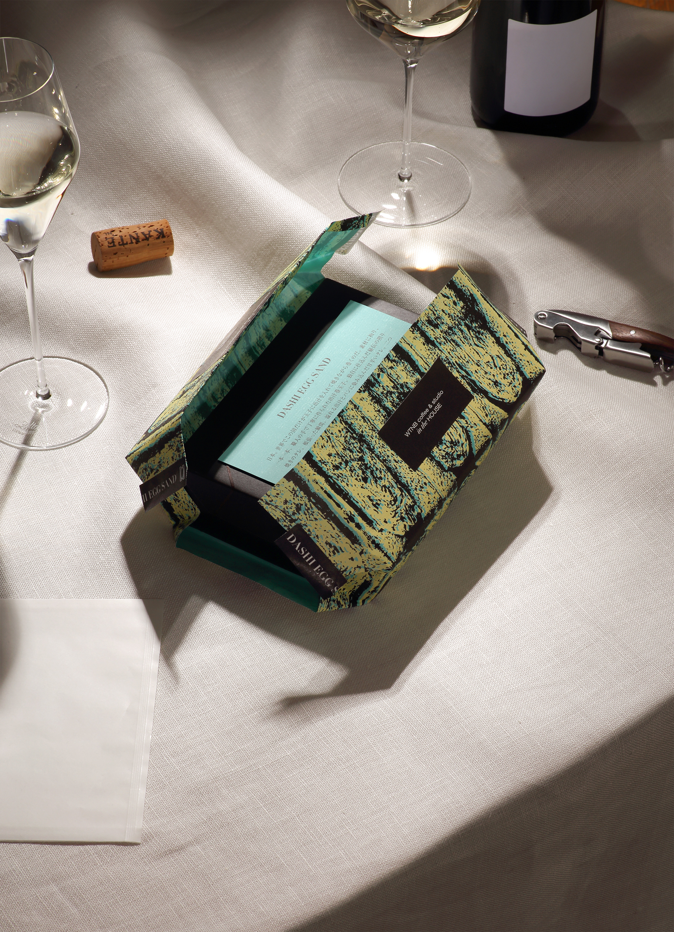
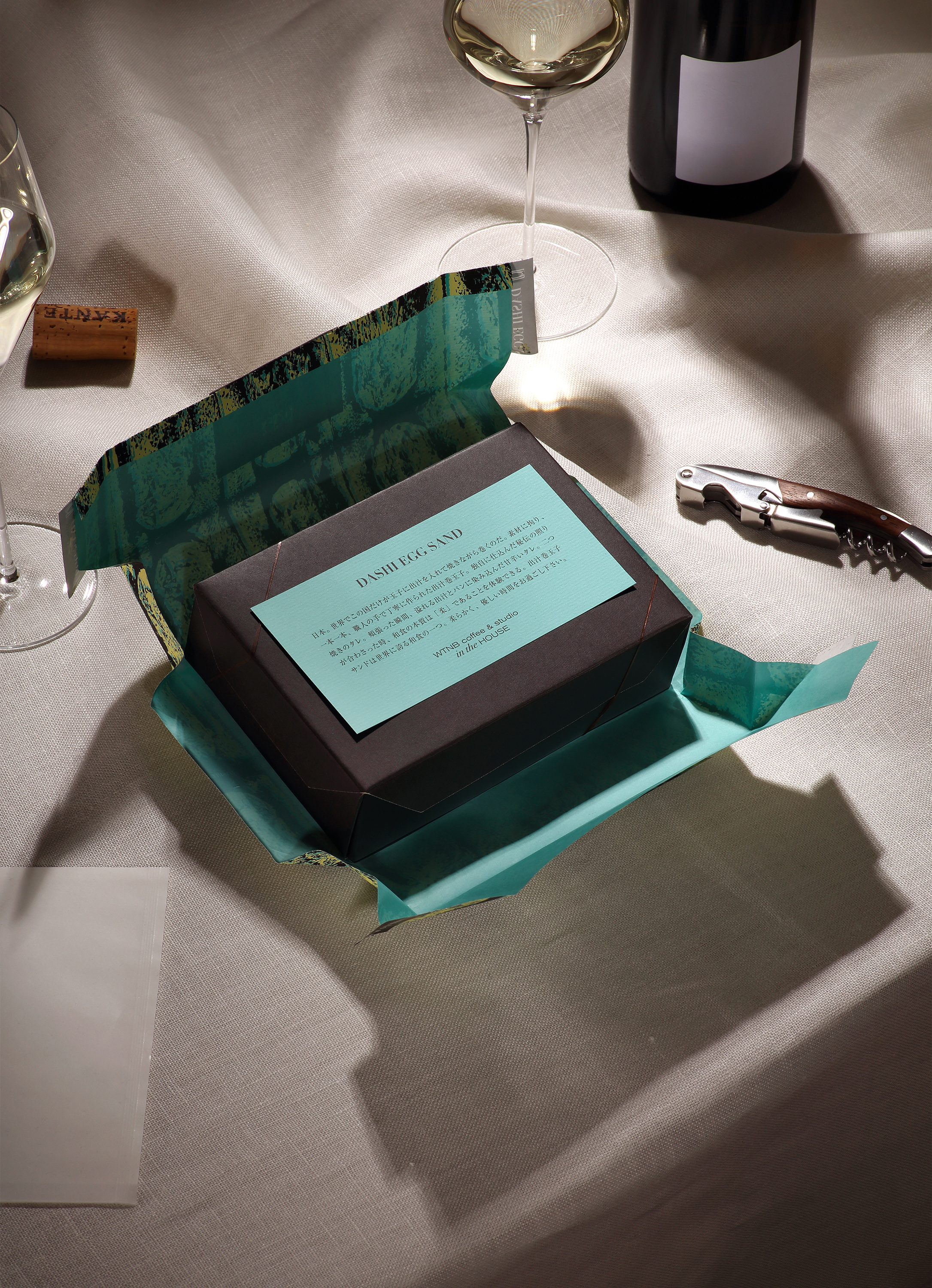
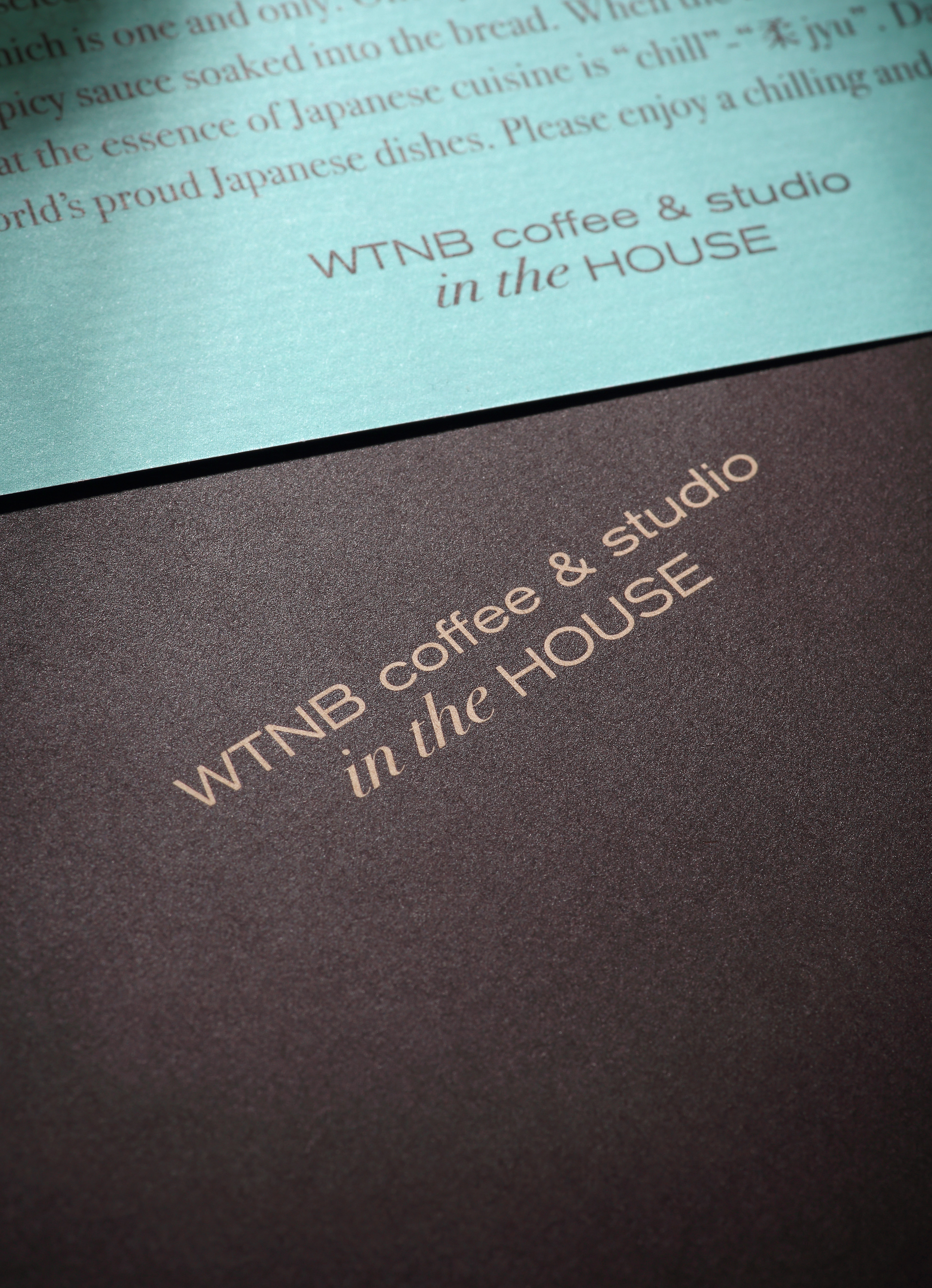
The ink is an original mix, expressing the color of eggs, secret sauce, and blue, the color for the client's store. The box is made of unbleached kraft paper with water and oil resistant processing that doesn't use plastic or film materials, aiming to reduce its environmental impact.
When the wrapping paper, which gives the impression of softly enveloping the dish, is opened, a first look reveals the contrast between the bright blue printed on the back and the brown of the box. Its form brings parties and picnics to mind. It has been thought up with improving the act in mind of having a special and enjoyable meal, rather than reluctantly filling the hunger.
Yuta TakahashiによるWTNB coffee & studio in the HOUSE "DASHI EGG SAND"のパッケージデザインを発表。
テイクアウト用の出汁巻玉子サンドのパッケージデザイン。美的な料理体験に必要なデザインは、テイクアウト食品でも考えることが出来る。 COVID-19がテイクアウトの消費量を増やしている為、食事が単に消費されるのではないことを保証するパッケージの必要性を感じた。
このデザインは、パッケージの中身の良さをどの様に表現するかというアイデアから生まれた。柔らかい包装紙とそのイラストは、出汁巻玉子の優しい食感を彷彿とさせる。包装紙には出汁巻玉子サンドの断面図を抽象化したものが描かれている。
インキはオリジナルミックスで、玉子の色、秘伝のタレ、そしてクライアントの店舗のイメージカラーである海の色、ブルー・クレールを表現した。箱は無漂白のクラフト紙で、プラスチックやフィルム素材を使用せず、耐水性・耐油性に優れた特殊な加工を施し、環境への影響を低減した。
ふんわりと包み込むような包装紙を開けると、裏側にプリントされた鮮やかなブルー・クレールと箱のダークブラウンのコントラストに目を奪われる。そのフォルムはパーティーやピクニックの気分を連想させる。しぶしぶ空腹を満たすのではなく、特別で楽しい食事をすることを念頭に置いて行動を改善するデザインを行った。


Back to Home
Follow us: Behance, Instagram
© Yuta Takahashi.jp